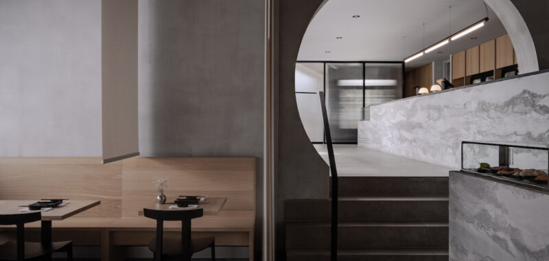
The orchestration of a memorable dining experience extends far beyond the plate. Restaurants place as much emphasis on the presentation of their food as they would the space. In many cases, a thoughtfully conceived interior often serves itself as a silent backdrop, its design subtly enhancing the culinary narrative without overshadowing it. Some cuisines demand a hushed, contemplative setting, while others thrive in an atmosphere of vibrant energy. It is this delicate balance between culinary offering and architectural ambiance that Future Simple Studio sought to achieve in their reimagining of Sushibox, a celebrated sushi establishment in Quebec City.

Led by chef Patrick Landry, Sushibox is known for its dedication to Japanese traditions, using the finest locally sourced ingredients. Future Simple Studio’s redesign aimed to enhance the dining experience by blending strong architectural lines with natural textures and a muted color palette. The result is a space that balances a brutalist aesthetic with a serene ambiance. Upon entering the restaurant, guests pass through a fluted glass vestibule into an interior anchored by a long concrete counter, handcrafted by artist Zian Miscioscia, in collaboration with Future Simple Studio. This counter, which intersects a large circular opening leading to the dining area, serves as a minimalist focal point.


Thomas Casault, owner of Sushibox, goes onto say: “We firmly believe that ambiance and aesthetics are essential to creating a remarkable culinary experience. With their redesign, Future Simple Studio merged functionality with artistic brilliance in an awe-inspiring way. They understood the essence of our mission of creating an environment that transcends boundaries and leaves a lasting impression on everyone who steps through our doors.”


The dining area, accessed through the circular opening and down a few steps, offers a more intimate atmosphere. The bar counter features individual lava stone pendants designed by David Pompa at each seat. A display of 16 recessed concrete squares showcases the restaurant’s sake and Japanese whiskey selections. Behind the bar, an open kitchen boasts a custom stainless counter complemented by white oak shelving. Frosted panels provide soft illumination for the production space. The dining area features black-top tables juxtaposed against large, bespoke planters by Edith Sevigny-Martel, introducing a natural element to the space. Motorized sheer panels offer flexible privacy options while allowing natural light to filter through.


To learn more about Future Simple Studio, head to futuresimple.studio.
Photography by Félix Michaud.

